Header anatomy
Desktop - Core elements
Mobile - Core elements
Desktop - Navigation
Mobile - Navigation
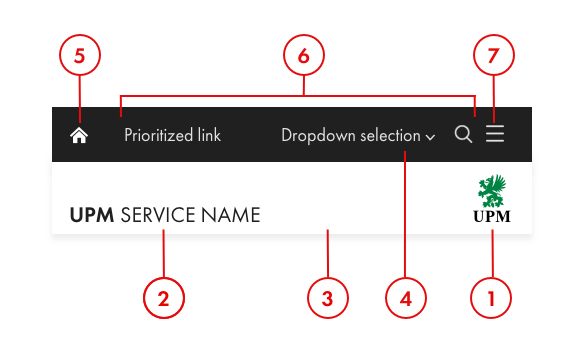
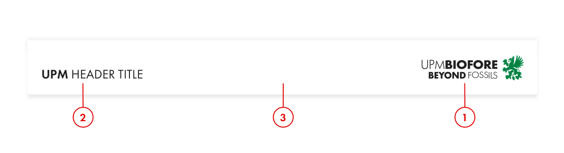
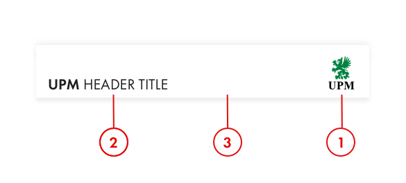
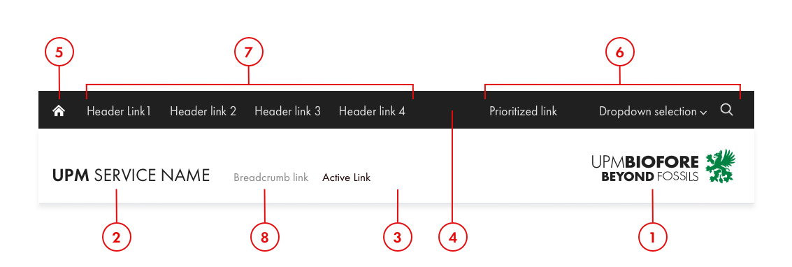
1. UPM Logo
The Biofore logo or the Company logo is always used on UPM header. It is placed on the right side of the header, aligned with the right edge of the content area and vertically middle-aligned. When scaling down to mobile view, it is recommendable to change from Biofore logo to Company logo. See Core Guidelines - Logos for more information.
2. Header title
In the header, the content title or the service name is always placed to the left and aligned with the left edge of the content area, and bottom-aligned with the UPM logo.
For UPM web services, the header name is always preceded by “UPM.” This should always and only link the user to the home page. Use capitalized Futura PT size 26 px weight 700 for the “UPM” and capitalized Futura PT 26 px weight 300 for the “Service name or business unit”. If you need to create new service names or logos please always contact UPM Brand.
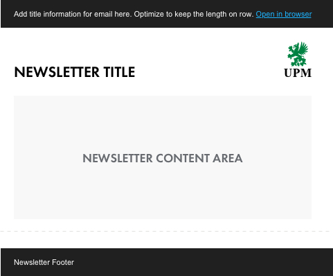
For e-mail header titles, use the UPM H4 style, or if the Futura PT is not available use Helvetica/Arial style, or use predesigned image file for business area name or product/service name.
3. Header bar
UPM header bar always has a white background #FFFFFF. Both desktop and mobile header bar height is 55 px. The header bar disappears on the web service when the user scrolls down.
4. Navigation bar
The navigation bar has a UPM Black #202020 background. On the desktop the navigation bar height is 111 px and on the mobile the height is 72 px.
5. Home icon
This should always and only link the user to the home page. Always use the Home icon from the UPM Style Guide for Digital icon library.
6. Prioritized Links
On the desktop, Prioritized links are utility functionalities like search, language selection dropdown, call-to-action or login for the service. When resizing the browser window, the right-hand menu is prioritized and stays visible. Use Futura PT size 17px weight 400 color #E1E1DF for the text links or Primary button for the call-to-action. The hover of selected state background is white. For the selected link weight 600 and color #202020 and white background. When a dropdown selection is used and the navigation item is open, the chevron should point up. Always use the UI Icons from the UPM Style Guide for Digital icon library.
On the mobile, Prioritized Links stay visible on the Navigation bar. Use Futura PT size 17 px weight 400 color #E1E1DF for the text links.
7. Header Links
On UPM websites, links in the header provide page or product navigation.
On the desktop, header links will open a mega menu. Dropdowns open on click and are closed by either selecting an item in the menu or clicking another dropdown menu item. When the navigation item is open, the header link background is white. Use Futura PT size 17 px weight 500 color #E1E1DF for the page main navigation text links, for the selected link weight 600 and color #202020 and white background. For the second and third level links use Futura PT size 17 px weight 500 color #888 and for the selected link weight 600 and color #202020.
On the mobile, the header links move to the hamburger menu. The hamburger icon is used for opening the dropdown menu. Dropdown menu labels serve as a link to another page, the chevron icon will open a sub-menu when available.
The header links should not open a new tab or link to an external domain unless communicated with an external link icon.
8. Breadcrumb
The breadcrumb trail is a secondary navigation scheme that allows users to establish where they are. It is an alternative way to navigate in the service. Use Futura PT size 17 px weight 400 color #888 for the inactive breadcrumb item and color #202020 for the active. The breadcrumb levels are divided by a single small chevron. Current page is not part of the breadcrumb.
Header usability recommendations
• Show users where they are within the site by highlighting the current section. UPM Web Services will automatically highlight the current selection.
• Sub-menus help preview lower-level content. For large websites, use sub-menus and visual lift-ups to help users preview lower-level content.
• Present links in priority order. Higher-demand links should appear farther to the left.
• Use prioritized links for important call-to-actions or features like “Contact sales”, “Language selection” or “Search”.
• Use short and clear link labels. Don’t use jargon or unfamiliar terms.
• Always research your navigation. Conduct research with your users and base decisions about your site’s information architecture and navigation structure on your findings. Continue researching to confirm that updates meet your users’ needs.